
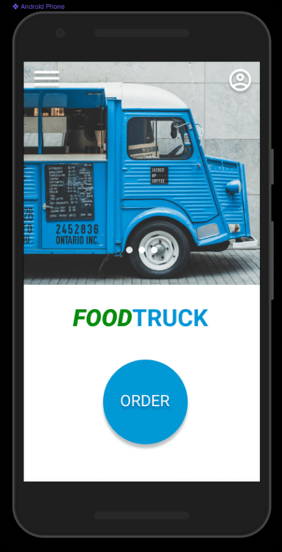
A new app to order lunch that allow customers to pre-order, complete payment online and go to location to pick it up.
The Project
The problem:
Resolve the problem of waiting times for our customers.
The goal:
Order lunch by allowing customers to pre-order, complete payment online and go to location to pick it up.
My role:
Lead UX designer
Responsibilities:
User research, wireframing, prototyping, etc.
Understanding the user
Research goals: Figure out if the new app will have a positive impact for customers.
We had the following key questions to answer:
1. How long will it take for users to complete an order?
2. How can we improve our order system?
3. Do we have any issues with the payment system?
● Six participants completed an order on their own. After completion they answered a questionnaire.
● It was an unmoderated usability study.
● KPIs: time on task, user error rates and system usability scale (SUS)
User research:
Pain points
- Schedule
- Menu
- Descriptions
- Clarity
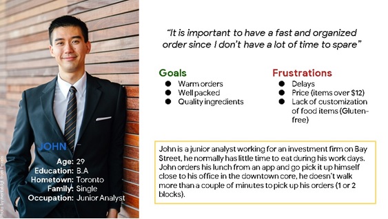
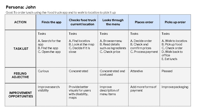
Persona: John
Problem statement:
John is a busy junior analyst who needs fast and affordable lunch options because he has only half an hour a day to eat during the week.
“It is important to have a fast and organized order since I don’t have a lot of time to spare”
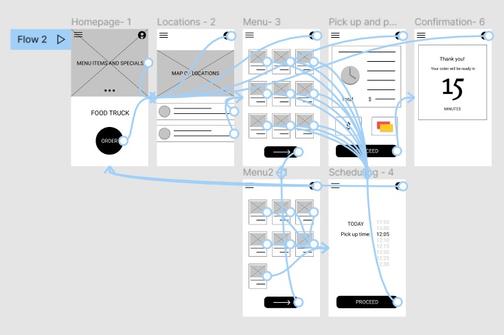
Starting the design
Paper wireframes
We started our iteration process by creating paper wireframes. Prioritizing the creation of a simple and smooth ordering process.
Digital wireframes
During the first phase of the design we set a few items that would be constant and the basis of our app.
Low-fidelity prototype
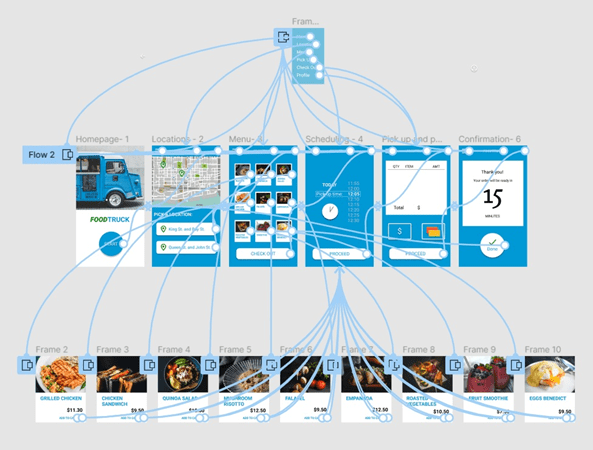
The low-fidelity prototype demonstrated the entire user flow.
Usability study: findings
We conducted a usability study in order to refine our design and start our high-fidelity prototype.
Round 1 findings:
- We need a better way to categorize menu items
- We need improvements in our schedule for pickup times
- We need better clarity and accessibility
Round 2 findings:
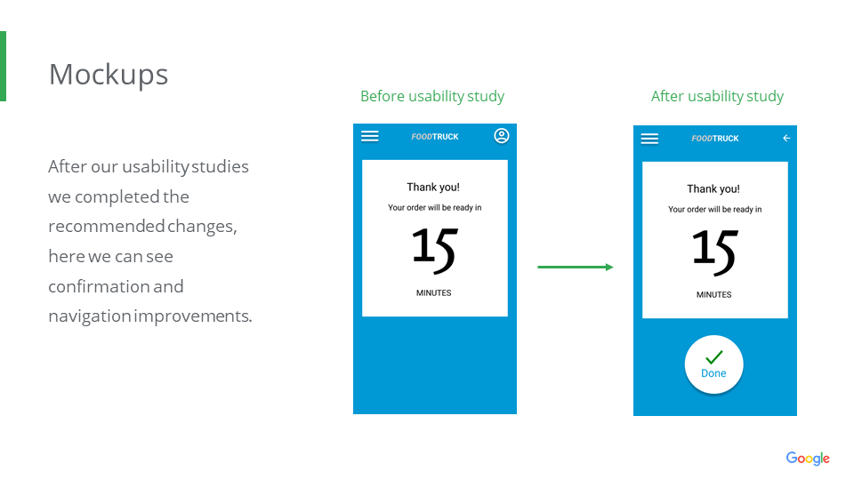
- We need better confirmation after completion of orders
- We need better navigation
Refining the design
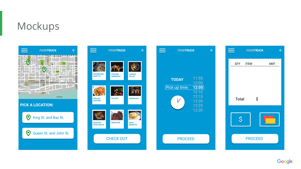
High-fidelity prototype
After our improvements and changes we had a better and more accessible app.
Accessibility considerations
- Implemented sufficient colour contrast
- Used simple icons and images
- Provided alternative navigation and menu access in all pages
Impact:
We are proud of our app, our final version received positive reviews from our users. It was a positive change and we hope to keep improving it.
What I learned:
This project showed us the importance of usability studies and feedback. Fundamental ideas came from our studies and reviews. We are very thankful for the goodwill and assistance provided by our users and peers.
