
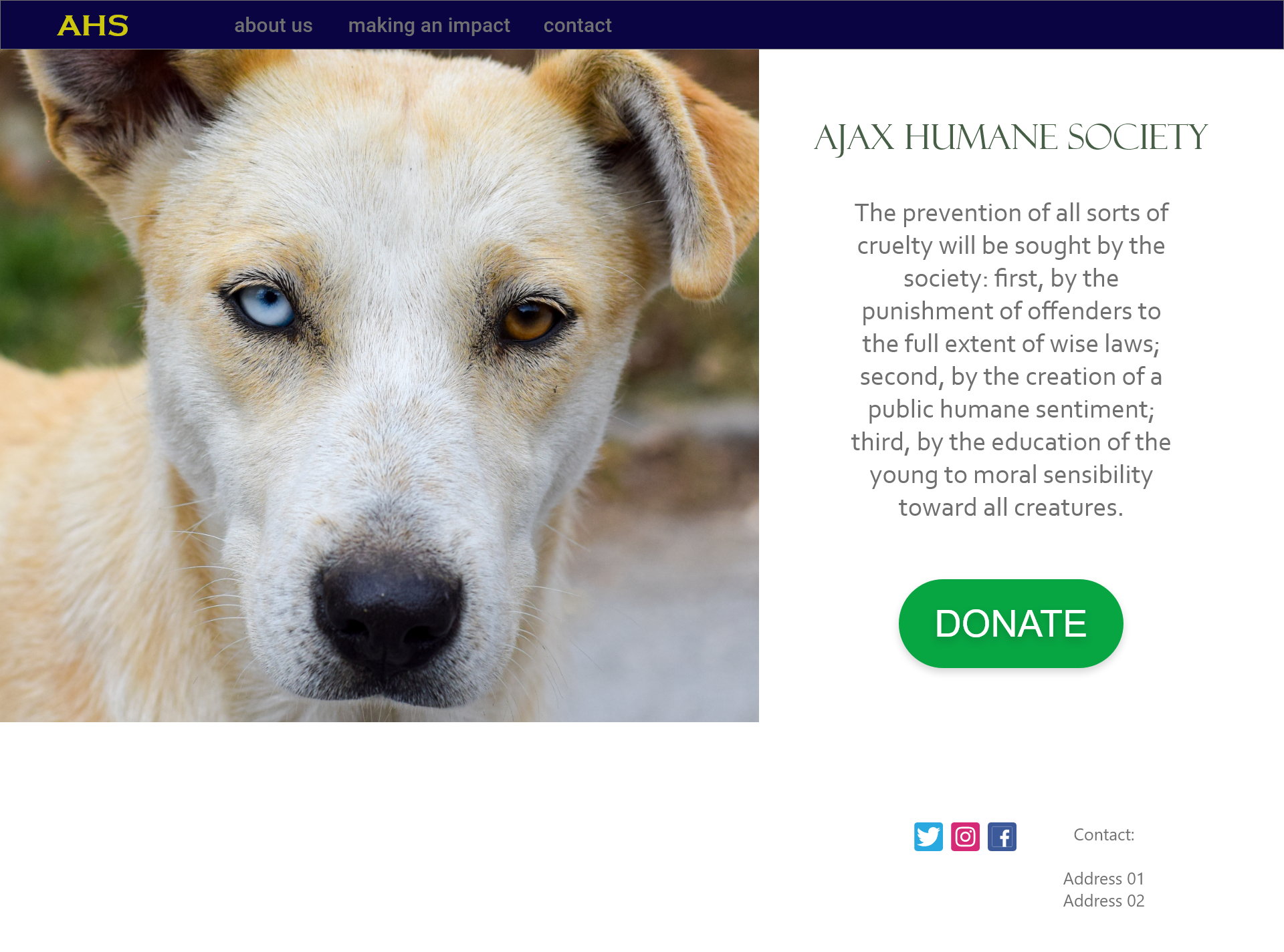
A new site to support the Ajax Humane Society, allowing patrons to make donations in a simple and easy way.
The Project
The problem:
Resolve the problem of a lack of a simple system to make quick donations to the NGO.
The goal:
Make an usable system for donations, allowing customers to quickly, safely and easily contribute to the organization.
My role:
Lead UX designer
Responsibilities:
User research, wireframing, prototyping, etc.
Understanding the user
User research: summary
Research goals: Figure out if the new app will have a positive impact for customers.
● We had the following key questions to answer:
1. How long will it take for users to complete an order?
2. How can we improve our order system?
3. Do we have any issues with the payment system?
● Four participants completed an order on their own. After completion they answered a questionnaire.
● It was an unmoderated usability study.
● KPIs: time on task, user error rates and system usability scale (SUS)
User Research: Pain Points
1.
Lack of a button to quickly donate
2.
Lack of a proper menu
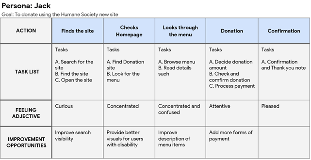
Persona: Jack
Problem statement:
Jack is a busy professional who needs a fast and organized system since he can only allocate some limited time to this activity.
“Ideally I would only need a fast way to complete the donation, without any holdbacks, since I already know what they do.”
Goals:
Fast donation
Well organized
Clear
Frustrations:
Delays
Excessive fees
Lack of clarity
User Journey Map
Starting the design
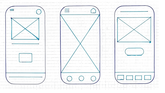
Paper wireframes
Process
We started our iteration process by creating paper wireframes. Prioritizing the creation of a simple and smooth ordering system.
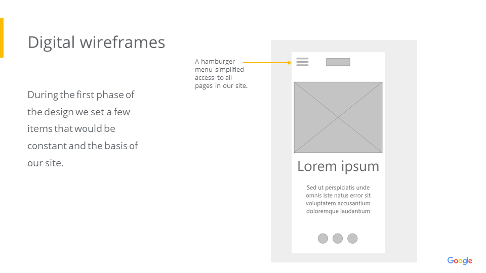
Digital wireframes
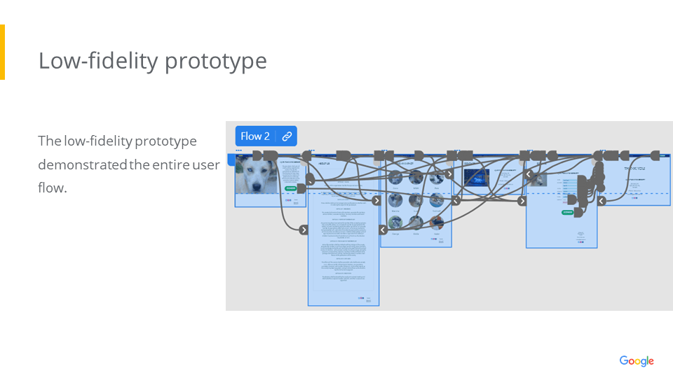
Low-fidelity prototype
Usability Study: findings
We conducted a usability study in order to refine our design and start our high-fidelity prototype.
Round 1 findings
We need a better way to categorize menu items
We need to improve the buttons
We need better clarity and accessibility
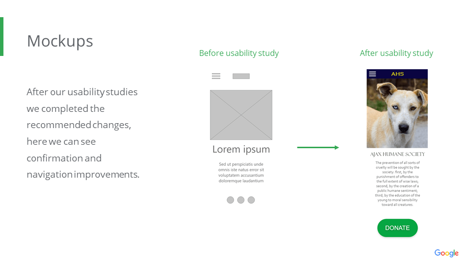
Round 2 findings
We need better confirmation after completion of donation
We need better navigation
Refining the design
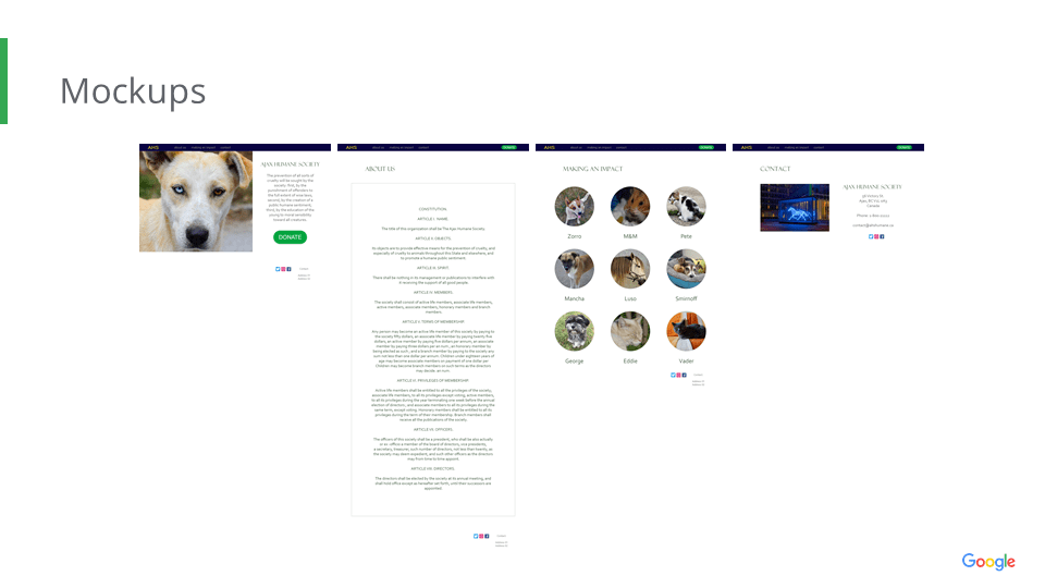
Mockups
High-fidelity prototype
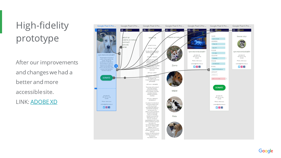
Accessibility considerations
1
Implemented sufficient colour contrast
2
Used simple icons and images
3
Provided alternative navigation and menu access in all pages
Takeaways
Impact:
We are proud of our site, our final version received good reviews from our users.
What I learned:
Fundamental ideas came from our studies and reviews. We are very thankful for the goodwill and assistance provided by our users and peers.
